Samsung Pay / Oct 2014 - Present
Samsung Pay is a global mobile wallet service supporting Android phones and wearable devices. Since its first launch in Korea and US in the fall of 2015, the number of supported markets has increased to nearly 20, covering Asia, America and Europe. Gaining more than 8 million users in Korea and US each, Samsung Pay has become the most dominant mobile payment solution in Korea. (https://goo.gl/UCsz5R , https://goo.gl/MQ5wjK)
One of differentiators is its offline payment solution called MST(Magnetic Secured Transmission). With magnetic signal including encrypted card information generated by the device, users can pay at any store that supports traditional plastic payment cards.
I’ve been participating as the main designer from the initial concepting of the service. I led the UX of the US version till December 2016, working closely with product management and engineering teams at the US branch (Samsung Research America). Currently, I’m leading the UX of Russia, Spain, Brazil and UAE markets as well as the global web portal for partners.
Version 1.0: Inform the users how quick and easy mobile payment can be.
The initial version was targeted for US and Korea with the main functionality being offline payment. I led the UI team consisting of 3 members and explored solutions to come up with the most efficient and intuitive experience for mobile payment. Eventually we presented Samsung Pay’s signature UX, Simple Pay and Payment Mode.
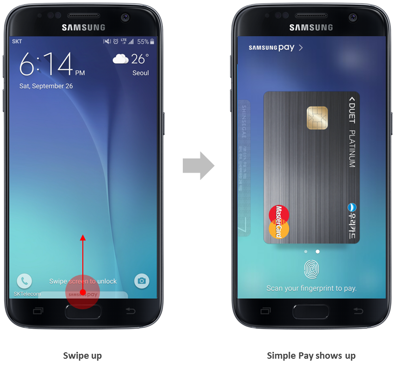
Faster and more intuitive than a plastic card
Plastic cards(Credit or debit) are currently the most convenient and universal payment methods.
Lots of mobile wallet services with good technical background had failed before because their UX was more complex and difficult in comparison to plastic cards.
To overcome these past examples, we focused on creating a payment process that is literally faster than that of plastic cards, while staying in line with user’s existing behavior.
• As a result, we came up with a new way of launching an app for fast offline payment. This payment module called Simple Pay can be launched by swiping up card-shaped hint image at the bottom of the lock screen and home screen. This interaction was inspired by the physical action of pushing out your credit card from your wallet using your fingers.
• We also designed the layout of the payment module to be extremely simple, with no interruption from other design elements. Big card artwork and authentication module below help users to focus on their simple task of tagging their card on the POS.
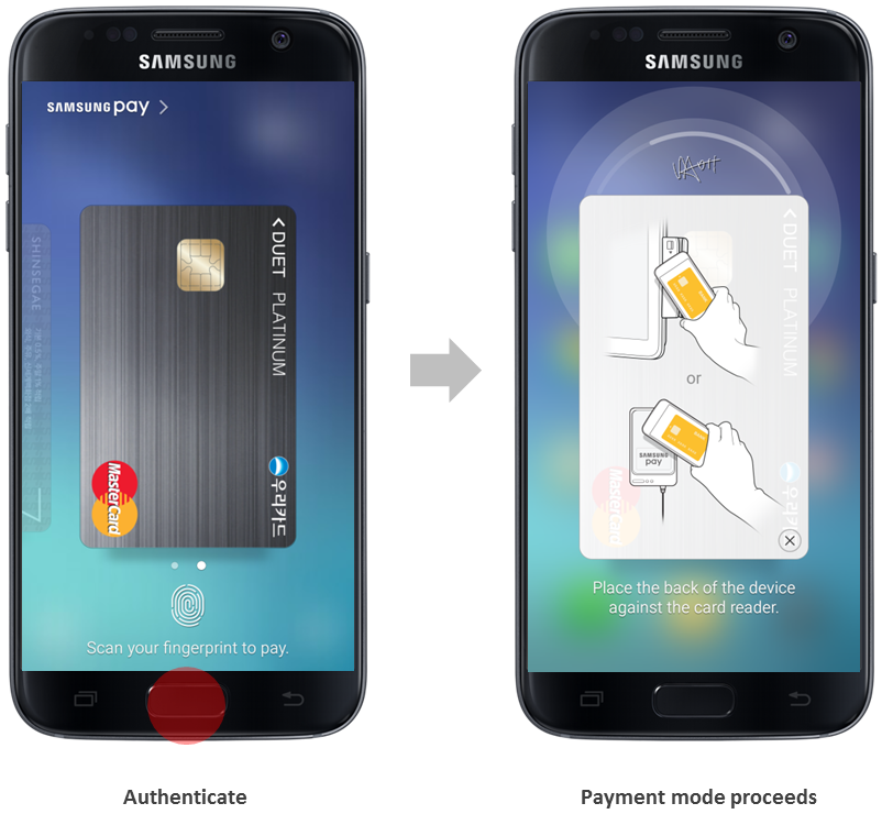
Carry the experience through the whole process
After authentication, payment mode lasts for a set amount of time.
We had to admit that it could be unfamiliar or a little strange for users having to place the phone on the POS. It could even be worse when the POS only has traditional plastic card rail. So we developed a rich feedback system from various angles.
• Circular animation behind the card visualized the magnetic signal, providing the clue which side of the phone should be touching the card rail or NFC dongle.
• Then we added haptic feedback on every second of the countdown, so users could be aware of the duration even when they are not looking at the screen.
• Lastly, we made a tutorial image which users can turn off when they get used to the process. We tried to be very specific, avoid vague and simple approach on this matter. We tested how the angles of wrist and the grip would be like numerous times until we translated the result into the instructive illustration.
Version 2.0: Provide more payment methods other than credit/debit cards
After a successful launch of the service, more payment methods like gift cards and membership cards were added into the roadmap. With 2 team members, I led the UI for the US market.
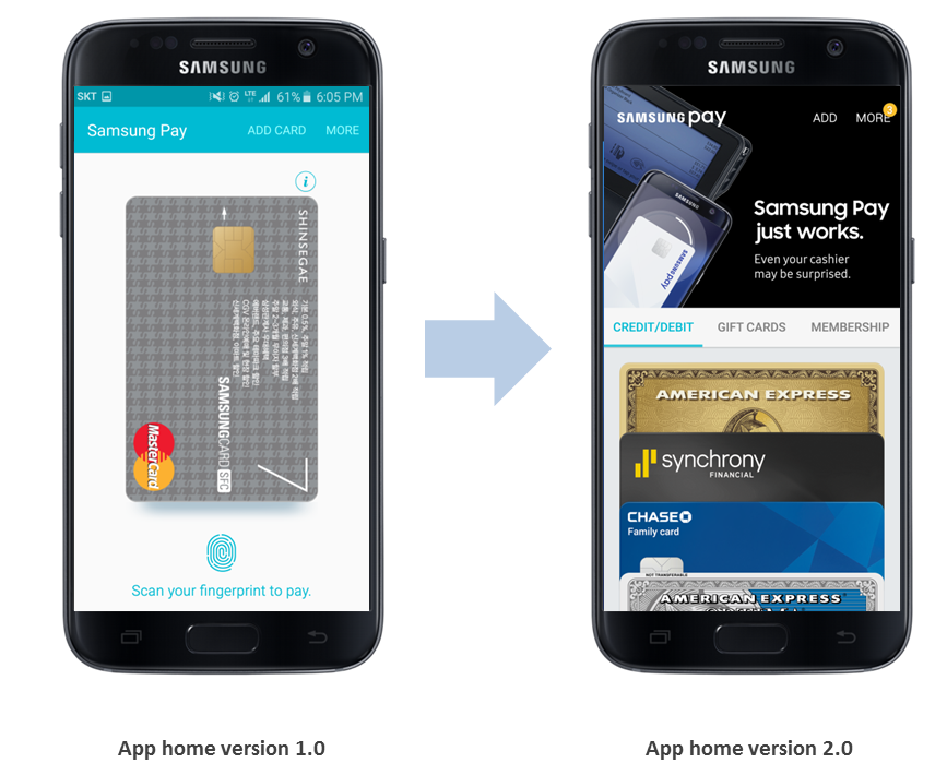
App Home revision
Initial version of Samsung Pay focused on marketing and expanding coverage of its offline payment availability with credit/debit card payment. We built the structure of the app Home to be as simple as it can be so the design itself could highlight main function of service.
As gift cards and membership cards were added to the service, we adopted a tab structure, which is the most familiar and effective way of categorizing different types of items.
Cards would stack as the number of registered cards increase. It is 1-2 for credit cards in average but becomes more than 5-6 for membership cards.
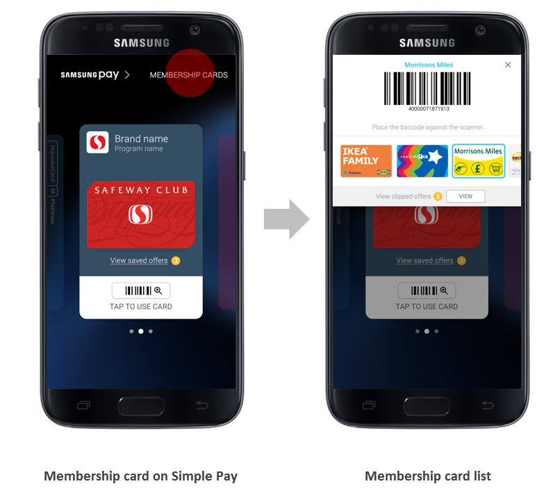
New elements on Simple Pay
The design of Simple Pay, the big card artwork and left/right swipe navigation were also revisited. People normally register less than 3 credit cards to Samsung Pay and tend to use 1 card mainly.
Membership card usage had a different scenario. More than 5-6 cards are registered and users changed cards often based on the location/store.
• We created a separate list only for membership cards which opens when user taps a text button(updated to an icon button few month later) in the upper right hand corner of Simple Pay. Users can open it for quick search and membership redemption, close it and continue with offline payment with a credit card.
• For users with less membership cards, the cards can also be listed in the main horizontal card list in the center as an option.
Version 3.0: Expand the service to a Fintech platform
Global expansion of Samsung Pay accelerated and functions were added constantly. I continued leading the UI of the US version and successfully produced the UX of new features, such as Rewards Program and Deals. Especially the Rewards program received great response from users and the media. Following the success in US, the model has been expanded to other countries including Korea, Singapore, Spain, Brazil. (https://goo.gl/ZSwDLi)
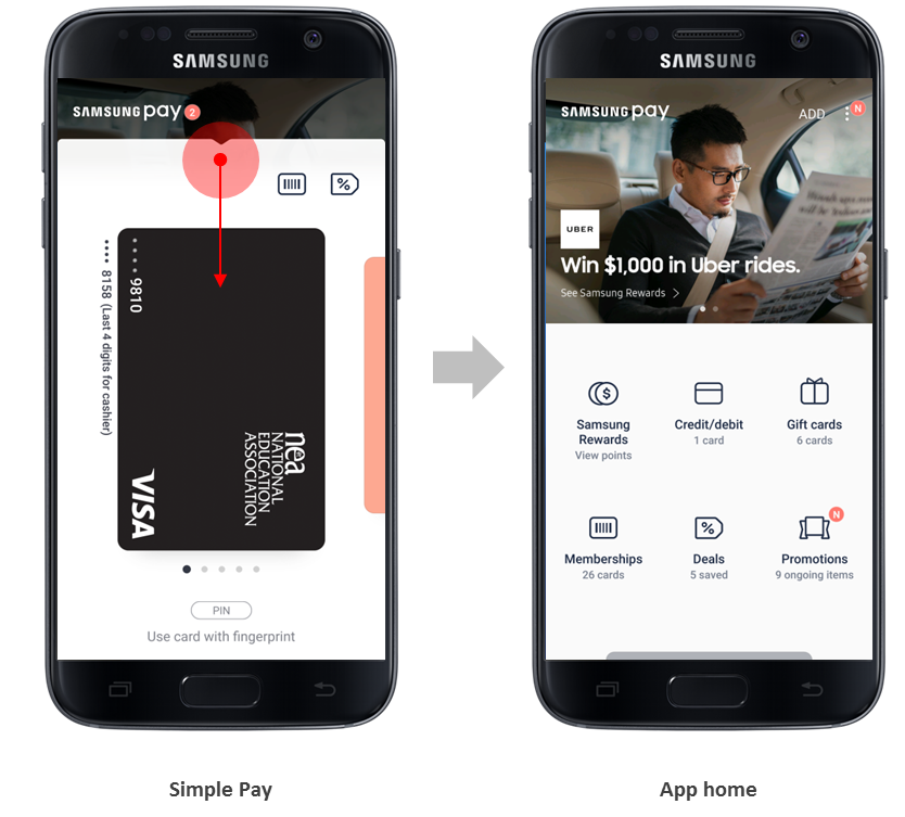
Simple Pay – App integration
The team had constantly been exposing the benefits information such as various events, promotions and rewards programs, but users still regarded Samsung Pay as a utility to help payment rather than as a holistic service. Most users just opened Simple Pay, paid and quit.
• To increase entry rate to the App and new benefits, we integrated the Simple Pay with Samsung Pay App itself. On Simple Pay, users can directly enter App home with a swipe down action. A glimpse of App home behind Simple Pay makes the connection more intuitive.
• We adopted the grid layout on the App home. It allows users to look at all features of the service at a glance, and is scalable for future additions of functions.
But I admit the grid layout has some points to improve upon. It is too static, all functions being displayed with the same weight. We are testing various ways to effectively expose useful and dynamic information such as transaction history and points accumulation status.
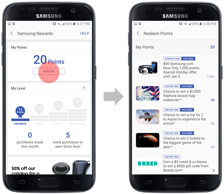
Samsung Rewards Program
Each time a user makes a transaction through Samsung Pay, he/she earns rewards points. Level of the user is increased according to the number of transactions, and as the level increases, more points can be earned in a single transaction.
Accumulated points can be used in a variety of ways. Gift cards or prepaid cards can be purchased, or coupons can be exchanged. User can also get opportunities to participate in various instant win promotions.
• From the UX perspective, we built the user journey to be linear and easy to understand from earning points to upgrading levels to redemption. I believe this feature was one of the success factors of the program.
• Most of the process is done in Samsung Pay without having to move to external apps or web sites, which keeps users focused.
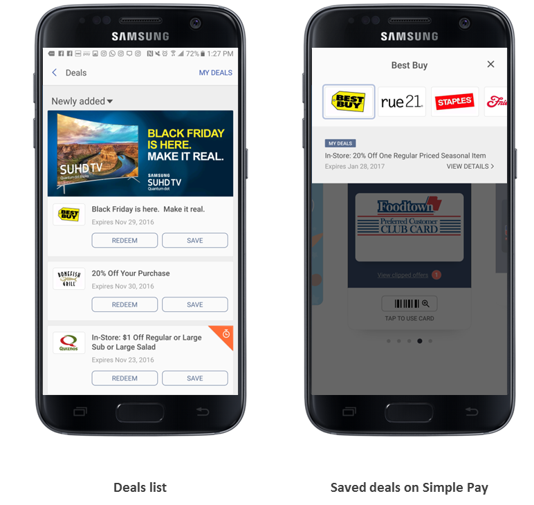
Deals & Offers
A small number of highly-curated offers are provided in Samsung Pay. Saved ones are easily found and redeemed on Simple Pay based on user’s current location.
• One thing I considered mostly during the UX process was to keep a consistent user journey. From my past experience of US coupons and offers business field, it was not a good idea just to provide a large number of coupons.
The more we depend on the system of partners or aggregators, it is hard to merge them into single user experience and the service becomes harder to use. I shared this point of view and discussed thoroughly with the product management and business teams through the process.
• We kept a similar approach with membership cards on Simple Pay. We added another icon button to Simple Pay and a separate list for saved deals.